Explore
Survey and interview responses
Our target group is undergraduate students at Wellesley, Olin, and Babson college. In order to learn more about the needs our customers, my team sent out a survey and conducted interviews. We received 68 survey responses and talked to 10 students. These are the key takeaways from the survey responses:
- On a scale from 1-5, 53% of respondents ranked their interest at a 4 or a 5 for joining projects at other colleges
- Main methods of promoting and finding projects are school websites, emails, and through mutual connections
- Some students want more connection among BOW students for the different perspectives it brings
- Current barriers to cross-campus collaboration are that it takes too much activation energy to coordinate between schools and that it would be harder to manage different working styles
Personas
From our interview and survey findings, we created 3 customer personas that reflect our stakeholder group.
- Ella the Olin student wants to join fun projects to meet people from different campuses. Olin has a lot of serious technical projects, so they are looking for other kinds of teams to join.
- Finley the Babson student is looking to create a startup, needs dedicated STEM majors to join his team to support backend roles, and has minimal experience working with students outside of Babson.
- Aleesha the Wellesley student wants to join a team of highly motivated students to work on long-term software projects with. She has joined organizations that were more for fun at Wellesley, so is looking for more serious projects.

Competitive analysis
We looked at similar, existing platforms and conducted some competitive analysis. This helped us identify where our design goals differ, aspects that we might want to incorporate to BOW platform, and where the inspirations fall short. My team looked at 4 main sites: Meetup, Eventbrite, Crunchbase, and AngelList Talent.
-
Meetup:
- Site's goal is to bring people together through shared interests and lets people search for events or groups- similar functionality to BOW Project Marketplace.
- Should try to avoid stacking group information in a single continuous scroll.
- Platform for event planners to promote their events to event seekers, and event seekers can find events based on their interests and apply different filters.
- BOW Project Marketplace will have significantly less search results, so some filtering features such as tags may not yield helpful result.
- Site provides strong summary of companies, including: size, location, funding status, site, talent search status, recent news, etc.
- BOW Project Marketplace is for student projects, so it would include different information.
- Website's target market is people looking for jobs, primarily those having already graduated college with prior work experience.
- Ability to search for companies by school or roles they are looking for could be a feature in BOW Marketplace.
EventBrite:
Crunchbase
AngelList Talent
Design Development
We used what we learned in the exploration about customer needs to create a portfolio of design ideas and explore various design requirements that meet those needs. All of these ideas are designed for students who feel restricted or intimidated by the currently available methods to collaborate, the activation energy required to look for opportunities, and the ways people communicate across colleges.
We decided to further narrow the scope of the projects that we wanted to serve: projects that span a semester or more but do not continue after college. This means we would be serving current BOW students looking for projects or recruiting for their projects, excluding one-time events like workshops or longer-term projects like startups by BOW alums.
Interaction flow
With the previously mentioned goal in mind for our specific customer group, we began thinking of features and high-level concepts that the BOW PM would feature. The result of our thinking is best seen through our interaction flow below, displaying our information architecture and planned pages for the site.
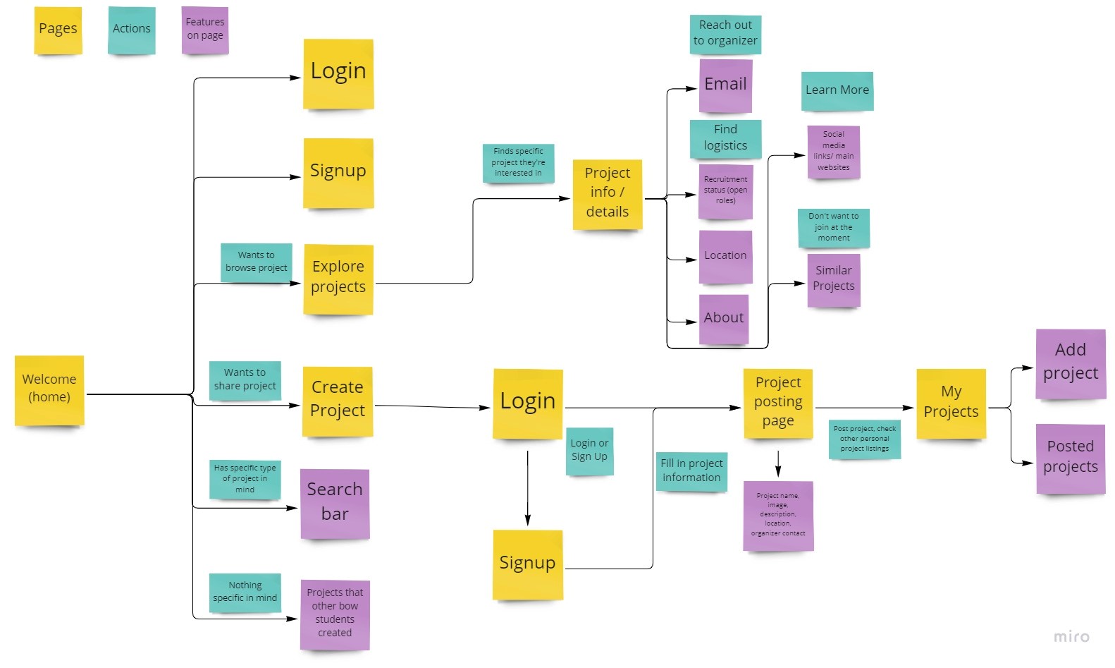
Key workflows
-
Exploring ongoing BOW projects
- Addresses need to easily see what students in the BOW community are working on.
- Allows students to explore projects that match the topic and commitment level they are looking for.
- Students who do not want to join a team but are curious to learn about projects.
- For project creators that want to promote their project or specific events coming up.
- Flexibility in the project creator's desired level of detail to accommodate low and high commitment projects.
- Requires an account on the platform to manage posting.
- Project creators that want to fill certain roles can source talent and students wanting to connect can talk directly to project owners.
- Flexibility of listing communication channels (email, social media, personal website, etc.)
- Strengthens sense of community.
Creating and registering BOW projects on site
Connecting with a BOW project (whether to join the team or learn more)
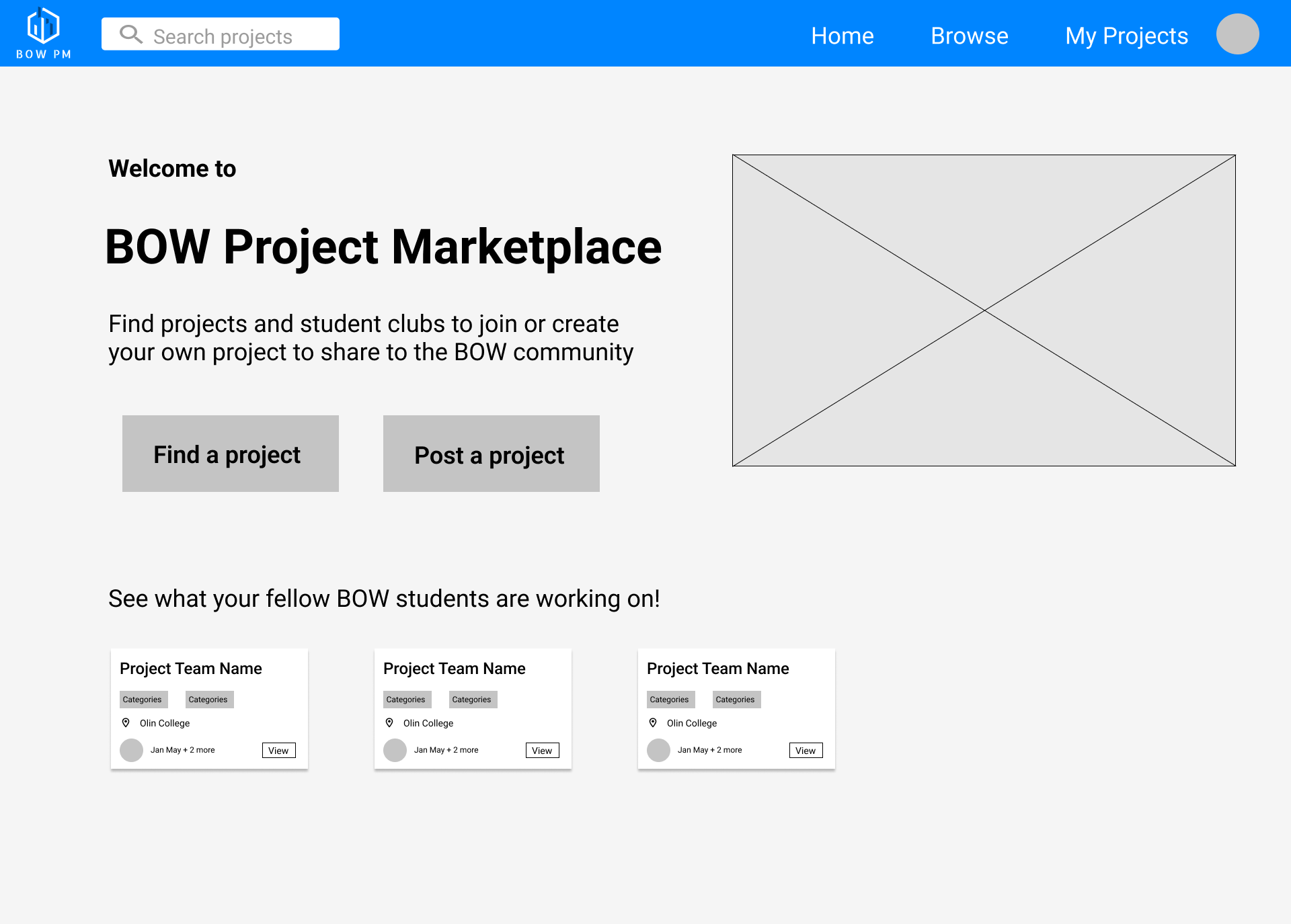
Low-Fidelity Prototype
-
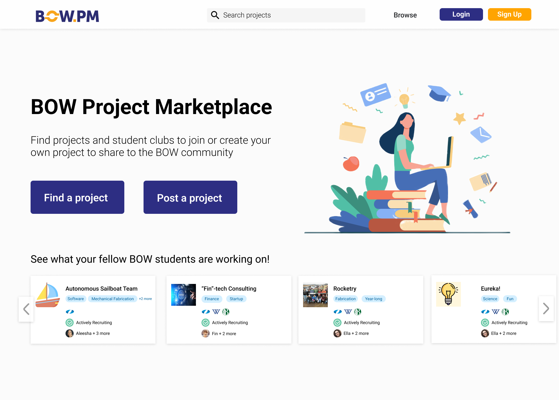
Home page
- Provide conceptual overview of site's purpose and intended use.
- Project seekers can click Find a Project which leads to browse page.
- Project creators must sign up or login to manage projects: intentionally only require project creators to make an account to minimize activation energy to browse projects.
-
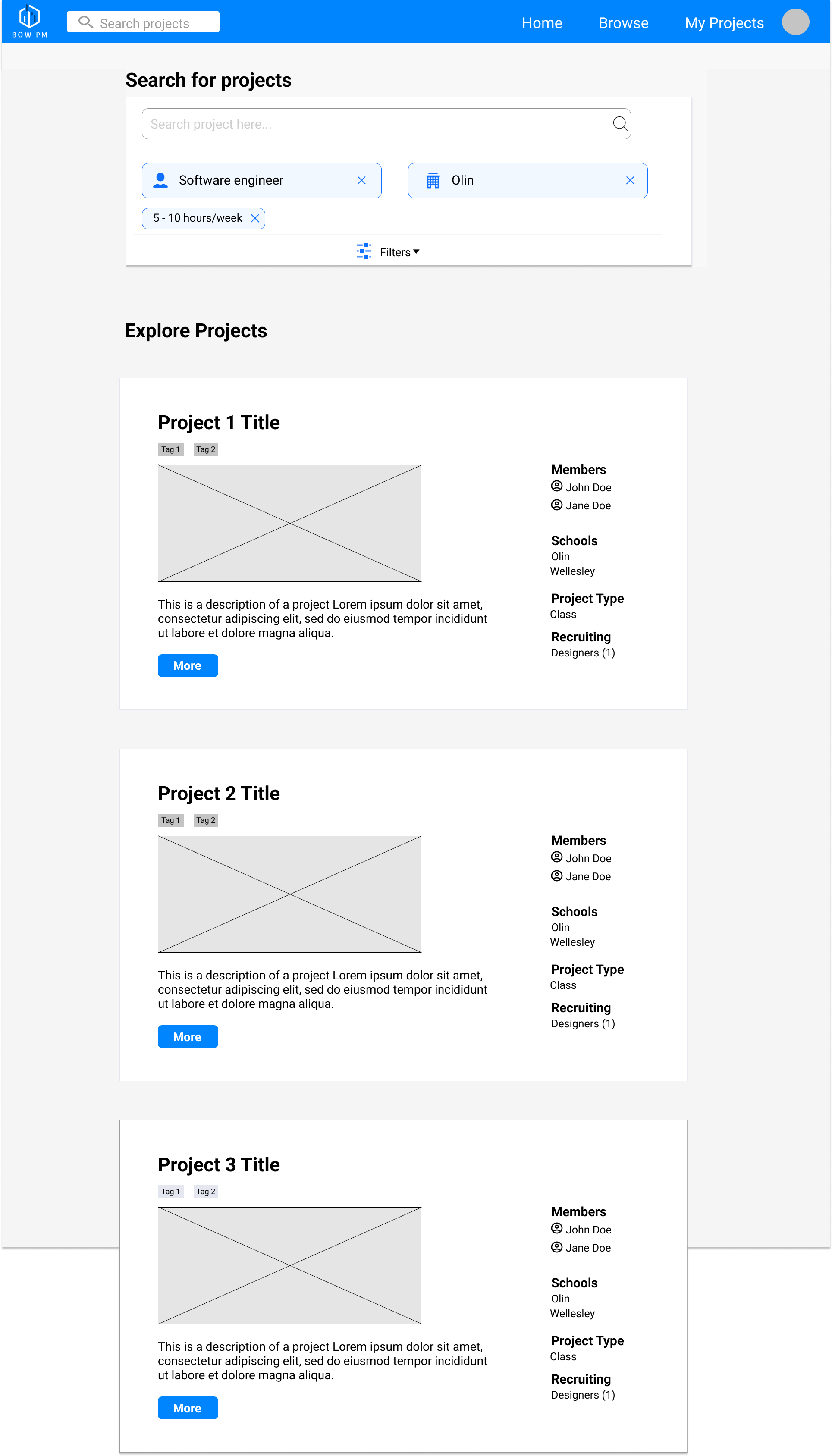
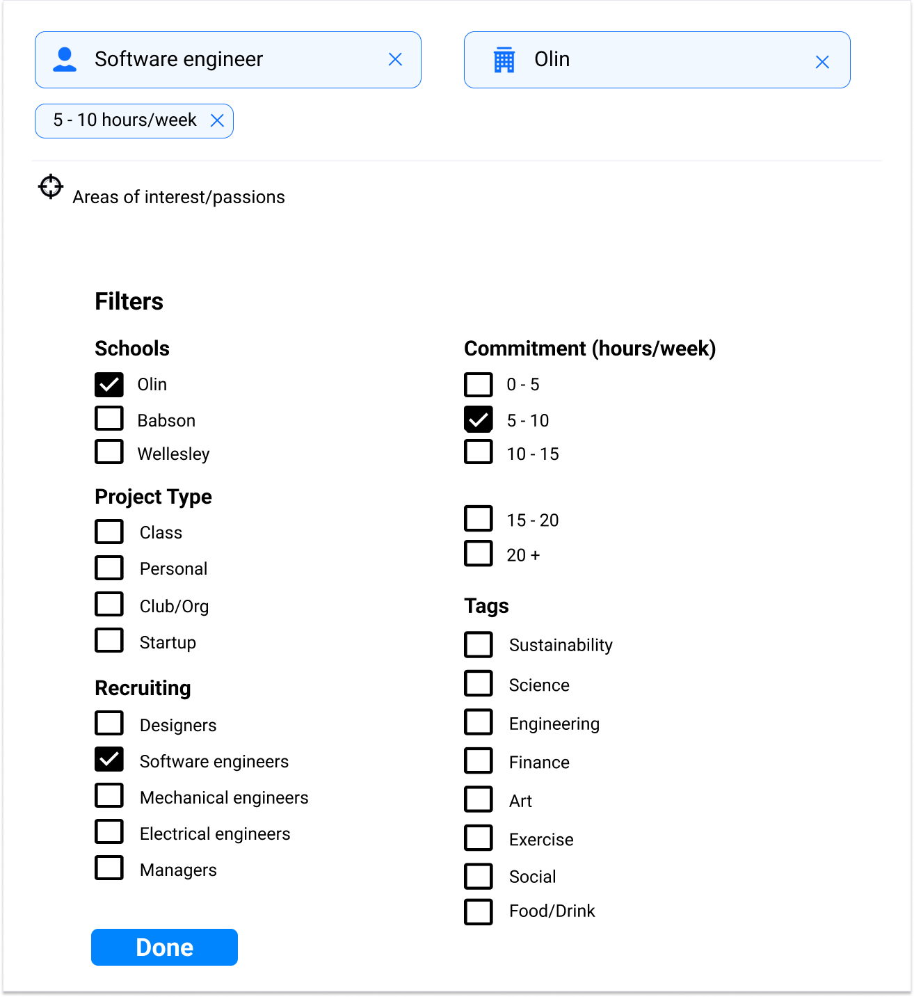
Explore page
- Conducted quick case study to choose between vertical and horizontal search bars: went with horizontal search bars which is similar to Angelist so that users with a filter in mind can apply it immediately.
- Filter selection opens as an overlay.
.png)
-
Project overview
- Provides summary of BOW project, including name, project type, schools, organizers, contact, etc.
- We considered 2 possible designs. The alternative design (inspired by Crunchbase) included more affordances and information, but displayed too much information for use by our customer group.
.png)
-
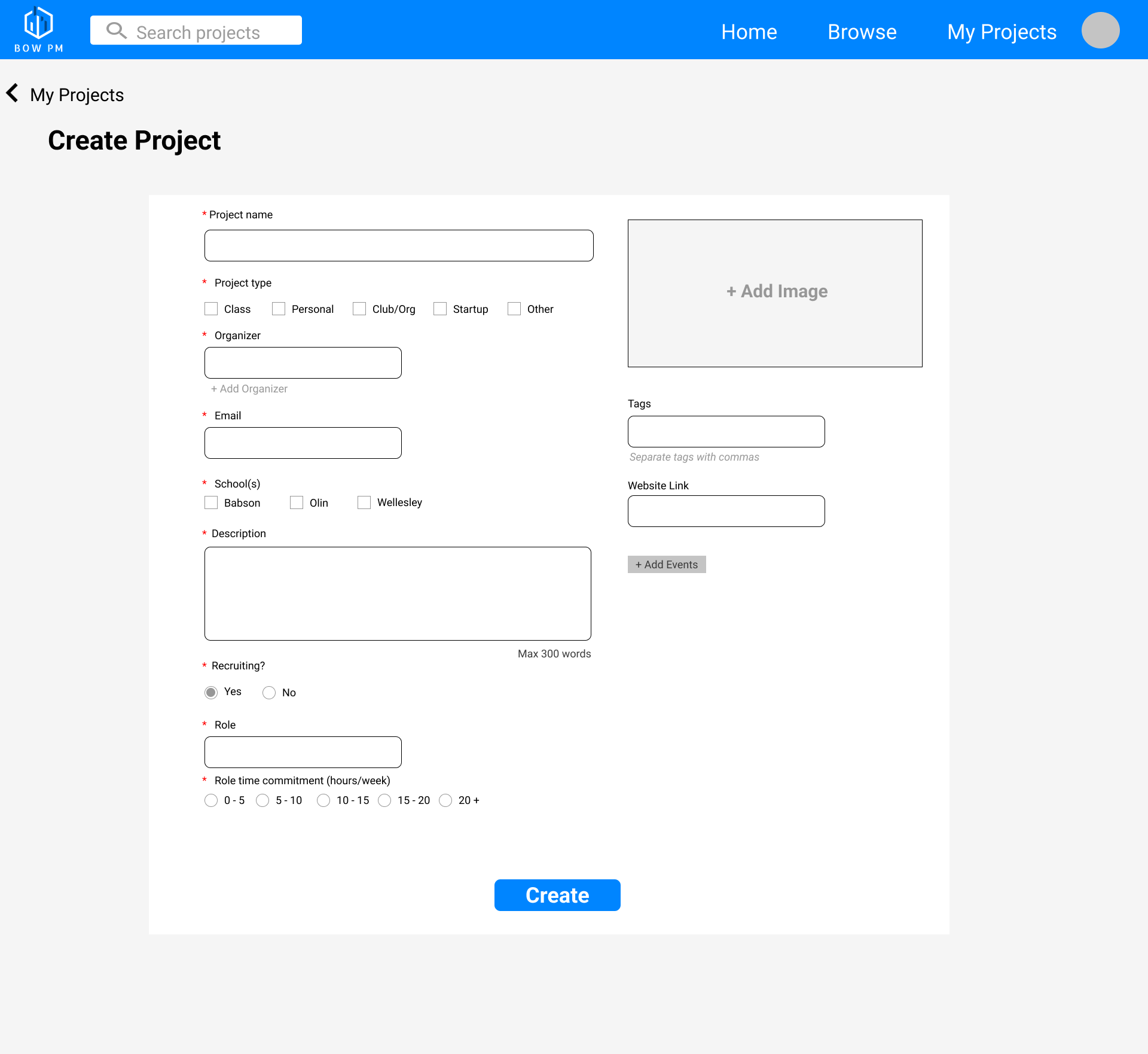
Create project
- Has required fields for basic information and has optional fields.
- Select checkbox for project type and school(s).
- Include affordances and signifies for required fields, maximum words, and ability to add extra fields
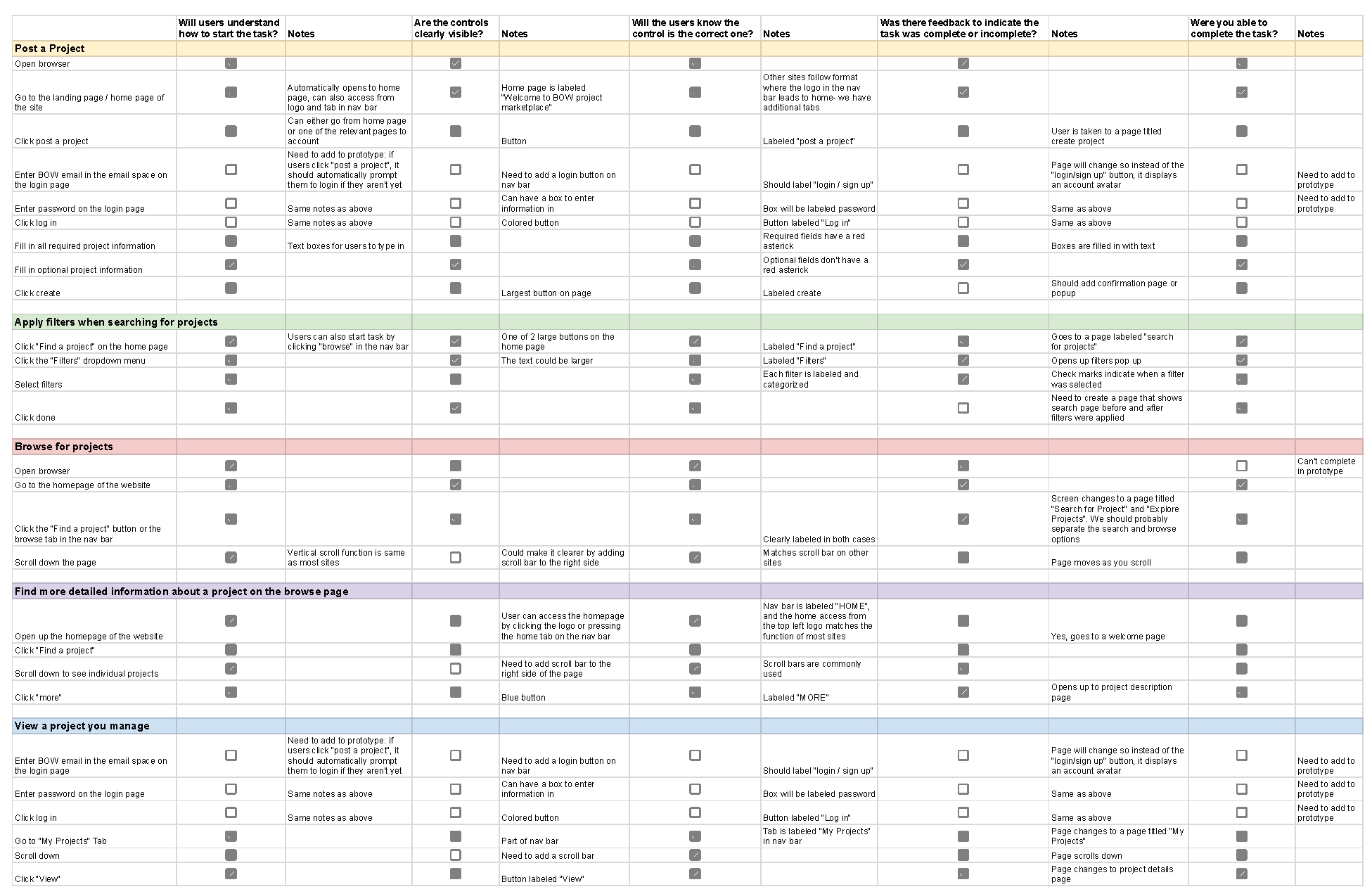
.png)
.png)
-1.png)